2026-05-06 · 3 MIN READ
Loud on purpose
Why this site looks like a transmission instead of a product page.
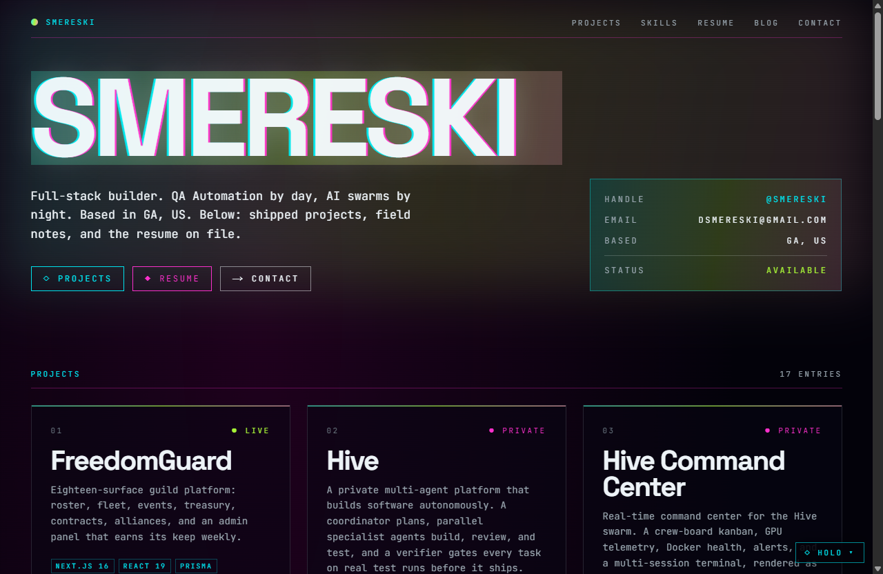
Most personal sites collapse into a centered name, a one-line role, and a card grid. Safe, identical, forgettable. This one refuses on purpose, and pays for it: loud filters out anyone who came for a calm résumé page. That is the trade, made on purpose too.
The rule is simple. Every visual choice does work. Scanlines mark a CRT vibe and pace the eye. Holographic stripes carry signal across an otherwise dark surface. Chromatic offsets on titles do the job a gradient would have done badly. Nothing decorative is allowed to just decorate.
Loud framing earns the right to a dense interior. Once the edges shout, project copy can stay terminal-tight, monospace, scannable. People come for the vibe and stay for the work, in that order.
Reduced-motion preference stops every animation. Static composition still reads loud through color and type. That is the contract: the volume comes from craft, not from refusing to sit still.
- 01prefers-reduced-motion
The CSS media query the site honors for animation.
https://developer.mozilla.org/en-US/docs/Web/CSS/@media/prefers-reduced-motion
- 02Built with /impeccable, in practice
Companion post on the design tool that shaped the look.
/blog/built-with-impeccable
- 03Theming as a product
How loud survives six different skins without rotting.
/blog/theming-as-a-product